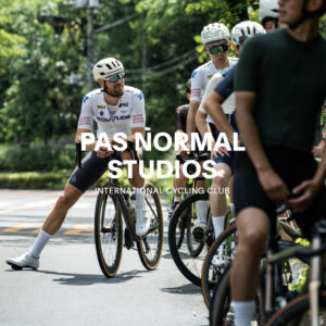
Cycling style has never had this many options. Between brands, fabrics, colors, sizes, and accessory pairings, the combinations are essentially infinite. Trends shift year by year too. Take the cycling jersey: the construction of today’s pieces looks nothing like what we were wearing a few years back.
Amid all this, most cyclists build their personal style through trial and error, taking a winding path of experiments and missteps.
But great styling follows a certain “grammar,” and knowing the basics of color coordination and accessory selection turns the search for your own kit into a far more rewarding journey.
You could argue the ultimate answer is “just wear what you like.” Yet, just as there is such a thing as a “beautifully built road bike,” there is undeniably such a thing as beautiful cyclist styling.
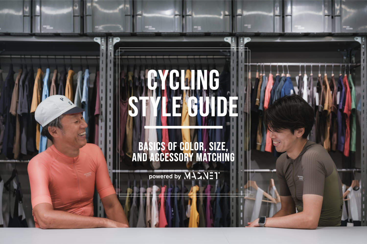
This time, using Pas Normal Studios — a brand with one of the broadest color palettes in the game — as a reference, we sit down with cycling journalist Tsukasa Yoshimoto to talk through the fundamentals of road cycling style.
The Speakers
 |  |
| Tsukasa Yoshimoto (@kop_2014) Former editor-in-chief of the monthly cycling magazine “Cycle Sports.” Today he works across a range of bicycle-focused projects. With over 35 years in sports cycling, his interests span every category of bike, not just road, and his knowledge cuts across everything from equipment to apparel. | Tats (@tats_lovecyclist) Editor-in-chief of Love Cyclist. 10 years in sports cycling. Enjoys discussing the road cycling industry through a marketing lens, and maintains close ties with international apparel brands, using the platform to propose a wide range of styles. |
Model / Hiroko, Miki, & Masanaga
Photo / Tats & Tong Liu
Edit / Tats [PR]
Contents
1. Color Coordination
Separate the race scene from everyday riding
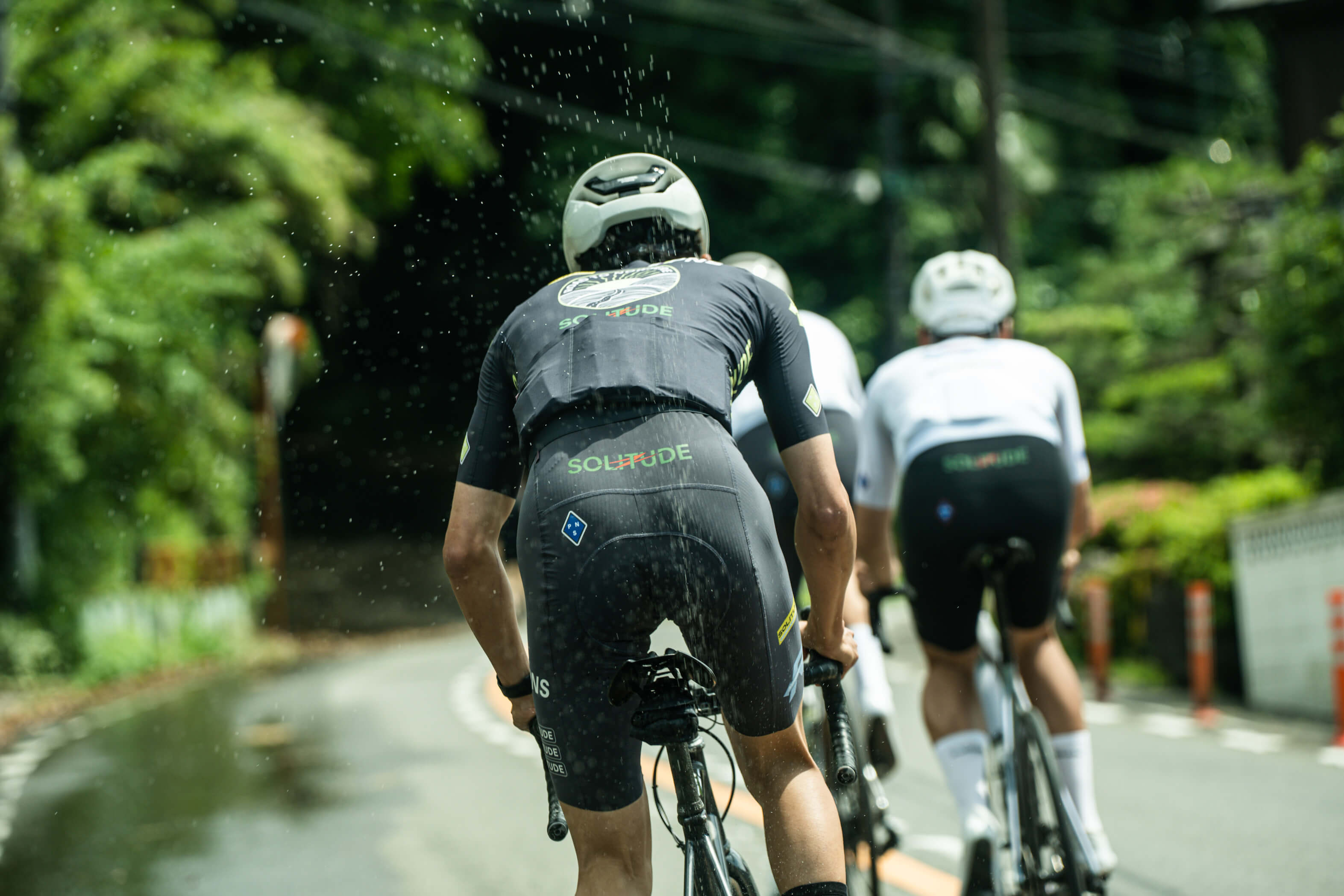
Tats: Riding a road bike in a T-shirt and something casual has become more common lately, but in the bigger picture that’s still a minority approach. So for this conversation I’d like to focus on the classic tight jersey + bib shorts setup.
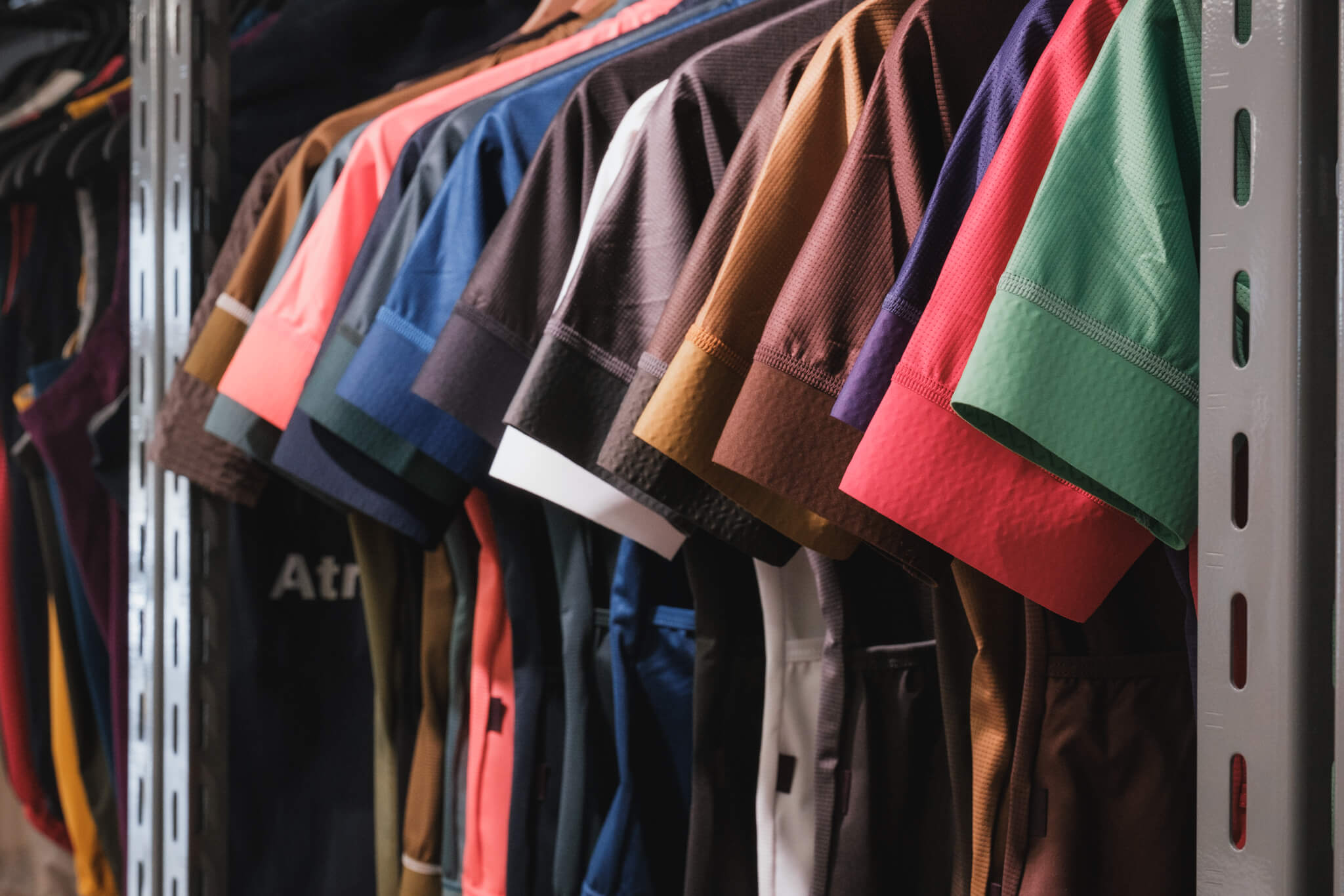
Yoshimoto: The color options, bib shorts included, have really exploded recently.
Tats: It’s a huge shift from the primary-color-heavy lineups we used to see.
Yoshimoto: If you go back, up through the 2000s everyone was watching road racing and mimicking that look. Race kit was designed to stand out within the peloton, so the color palettes were sharp and punchy.
Now, cycling has become more embedded in lifestyle, and the palette has shifted from standing out to harmonizing.
Tats: The turning point was around when Rapha put Team Sky in that black-based kit.
Yoshimoto: Exactly. Black kit basically didn’t exist before then.
Perhaps because of that shift, this year’s Tour dropped the tone of the maillot vert, and the reception hasn’t been great, precisely because it doesn’t stand out.
Tats: Oh, people don’t like it? I thought the deeper green looked good, but you’re right, it does get lost in the peloton. Race context and daily riding really do need to be treated separately.
View this post on Instagram
The maillot vert, now in a more subdued green
Yoshimoto: In everyday riding, it was really the rise of colored bibs around 2020 that expanded the range of styling possibilities.
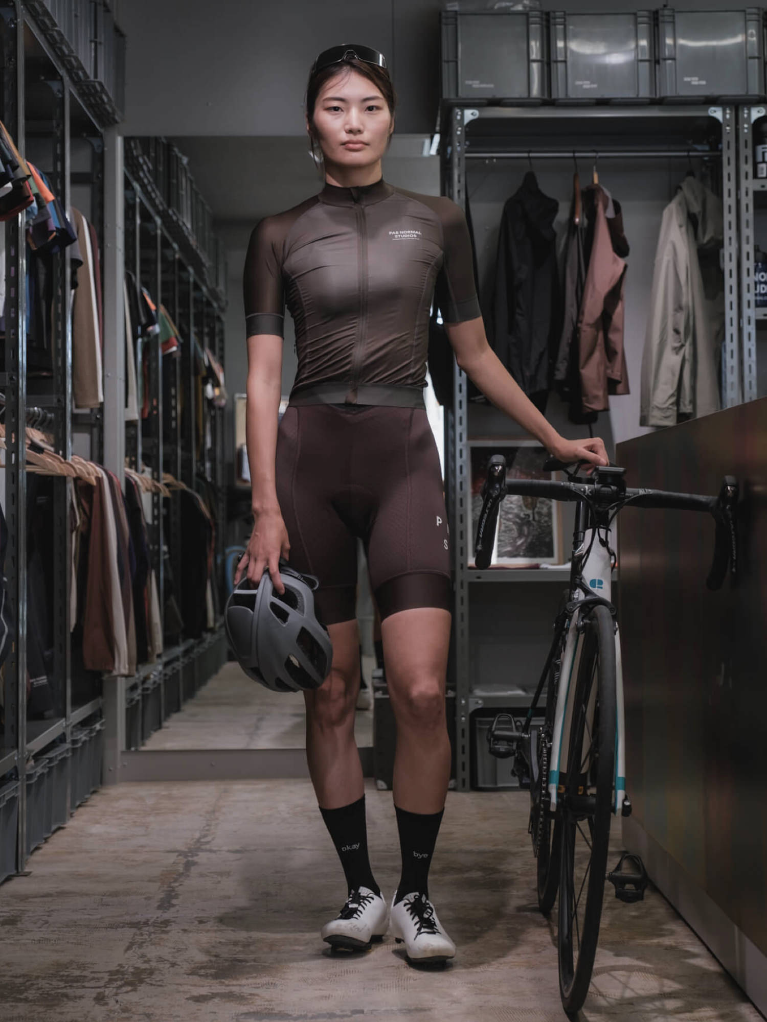
Tats: I’ve noticed more people gradually adopting them since around last year. Bibs used to mean black or navy and that was it, but the palette has grown to include deeper tones like grey, brown, and wine red. This year we’re also seeing brighter, more vivid shades like purple and beige.
Yoshimoto: Those brighter colors feel very much of this moment.
Styling starts with the bibs
Tats: From here, let’s look at actual styling examples by pairing jerseys and bibs.
Bibs are expensive to begin with, so owning several pairs and mixing colors the way you would with casual clothes can feel like a stretch. I hear that’s why most people end up settling on black or navy after all.
Yoshimoto: Black is the eternal staple. Even after wearing colored bibs, when you slip back into black you feel this is where it all starts. In summer, a white jersey with black bibs gives you a crisp contrast that’s both fresh and practical.
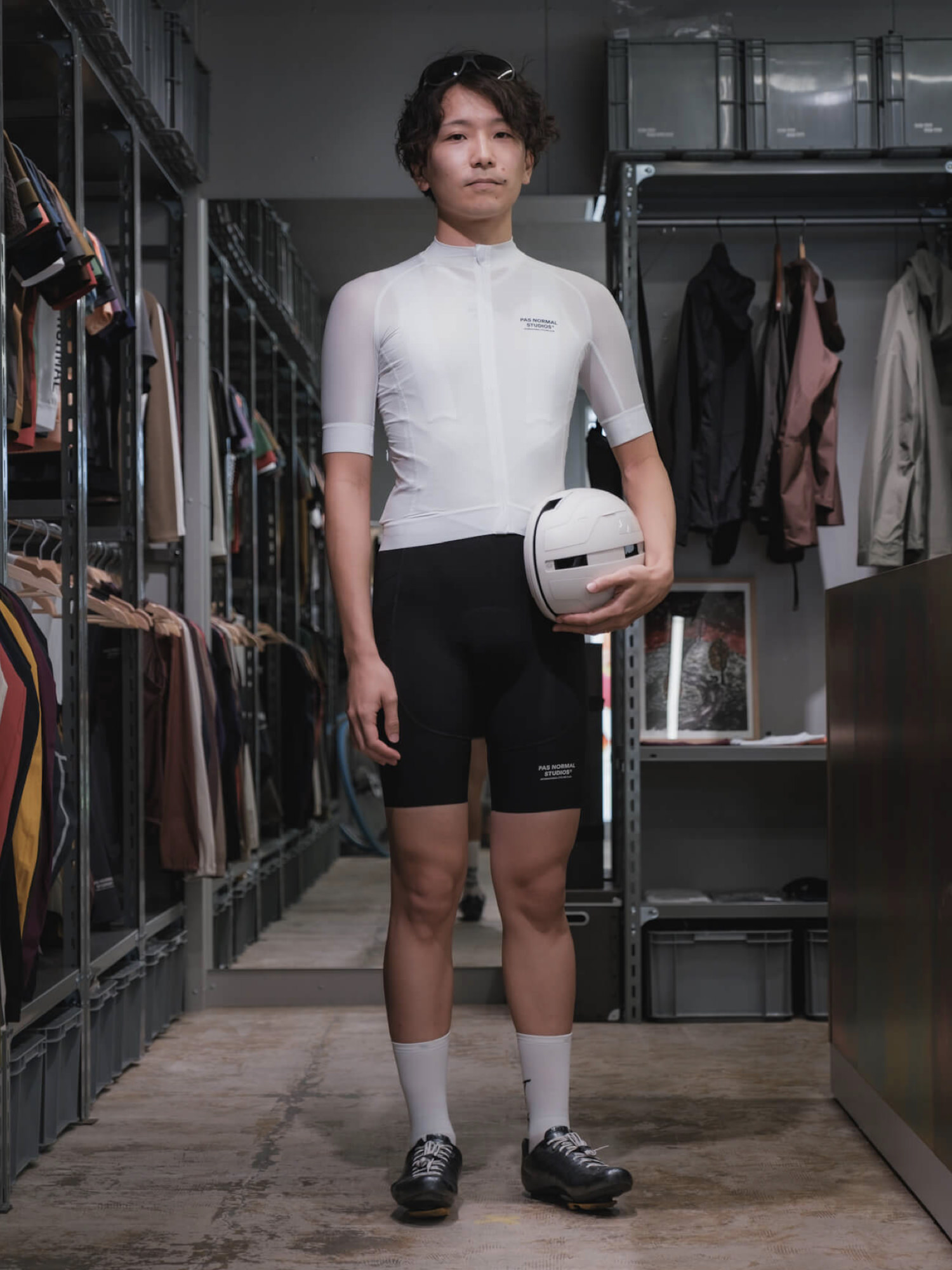
The classic white and black, with a clean freshness
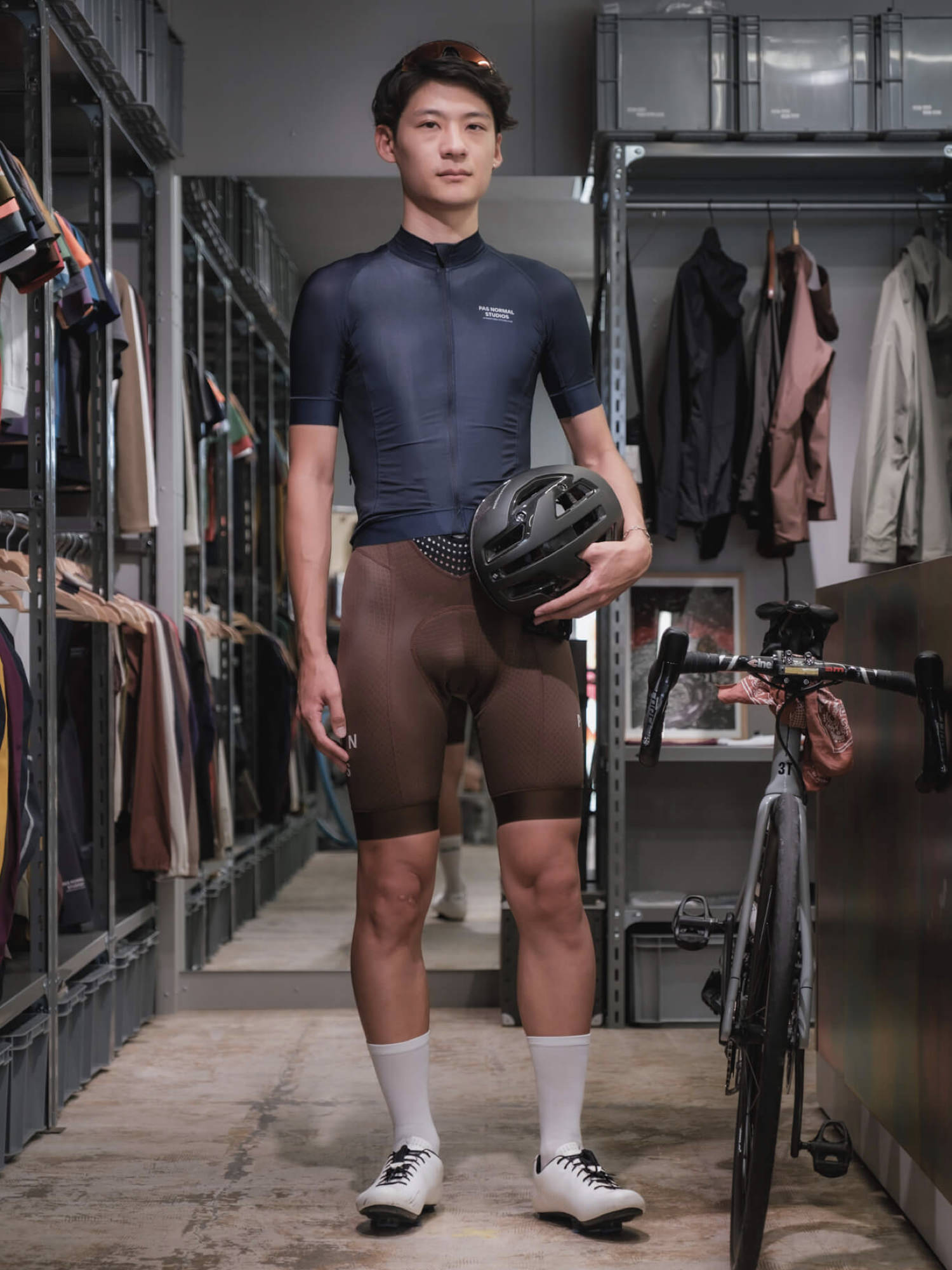
Tats: Navy also pairs with anything, but if you approach it with a color chart in mind, going tonal with navy on navy or building contrast with complementary tones like navy and orange, the look becomes far more striking.
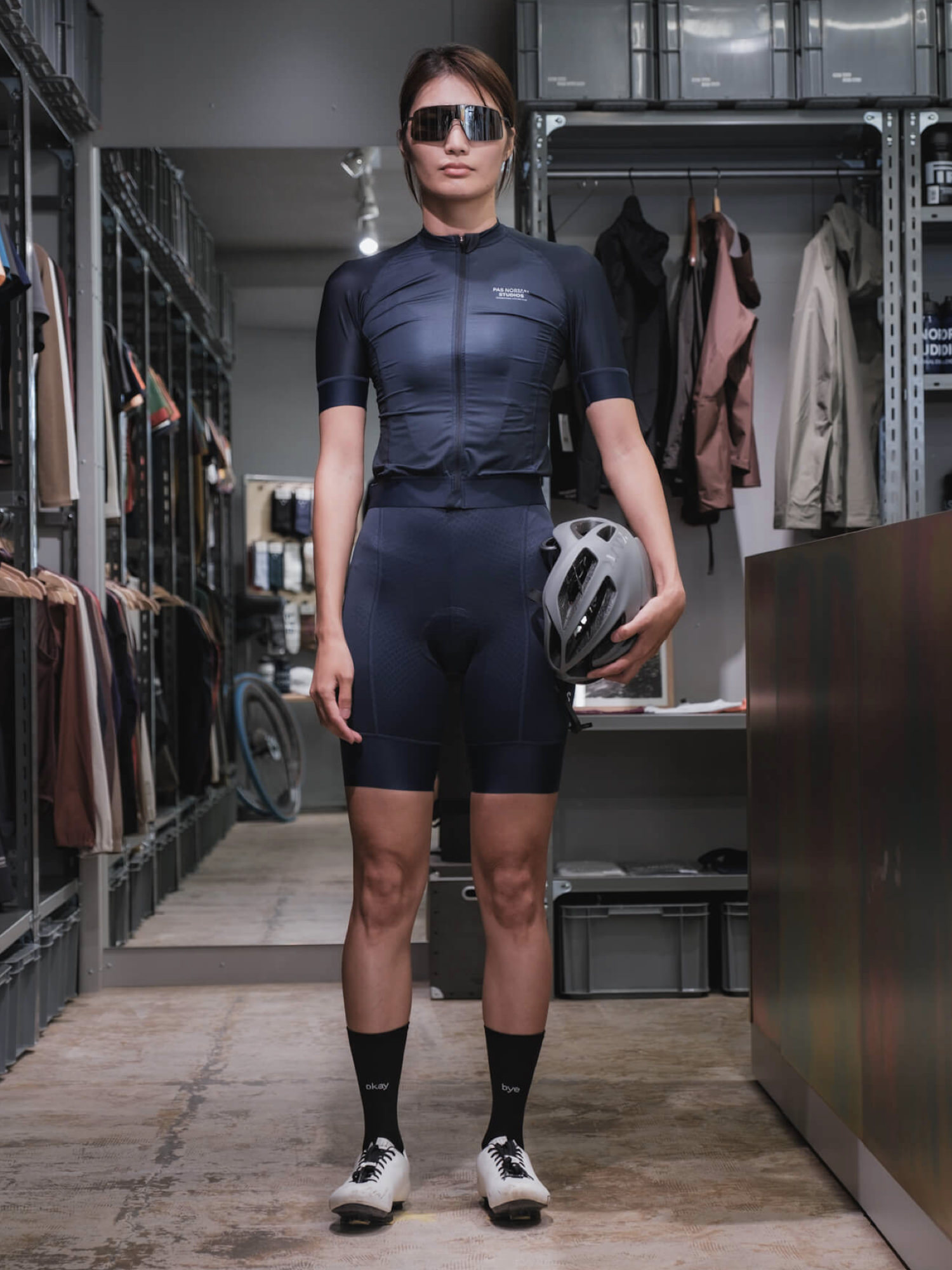
A tonal setup that lands with cool composure
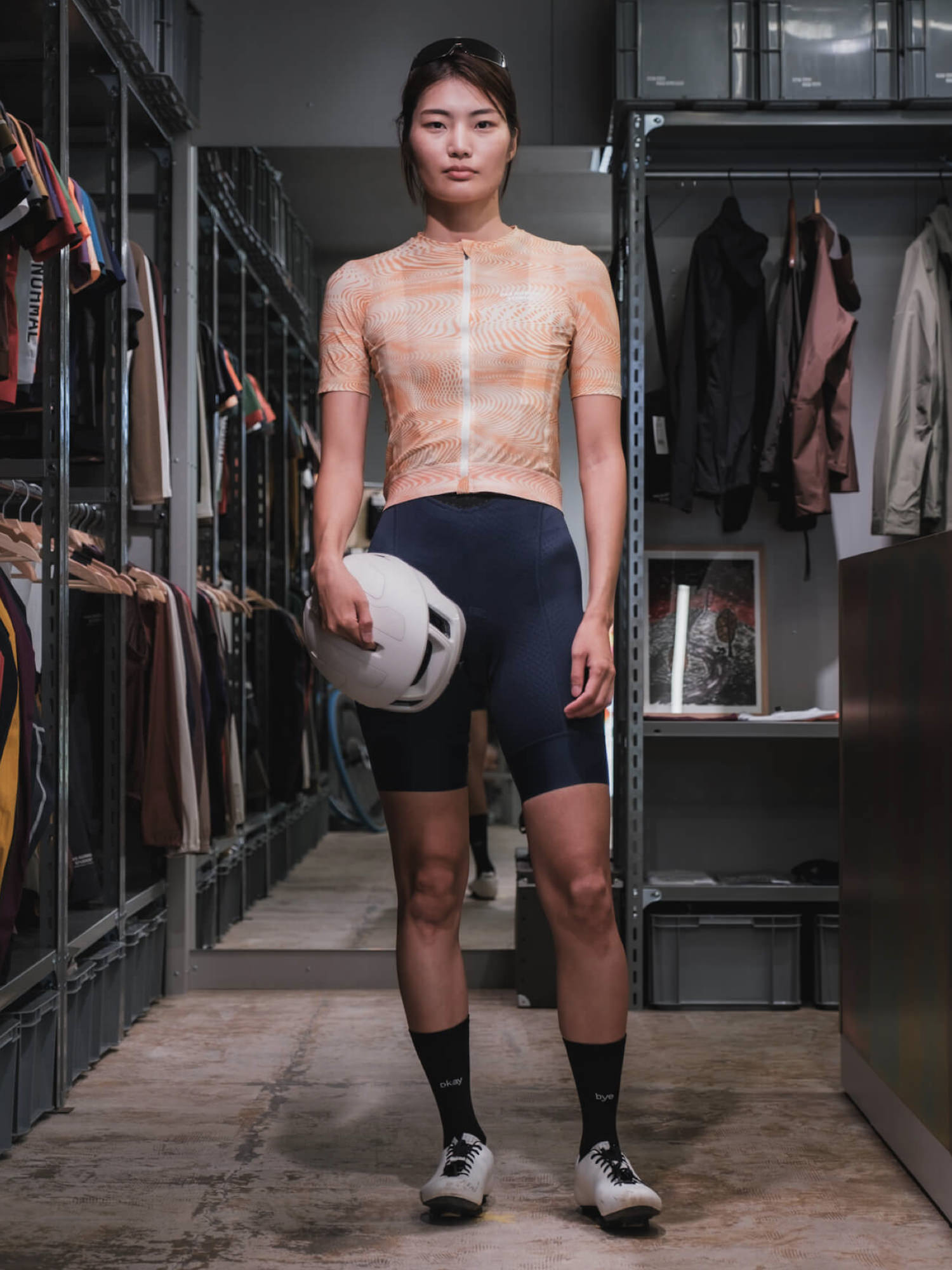
Orange and navy, brimming with summer energy
Yoshimoto: Even a standard bib takes on a fresh atmosphere.
Your next bib shorts: what color?
Yoshimoto: For someone stepping outside black or navy for the first time, what color would you suggest?
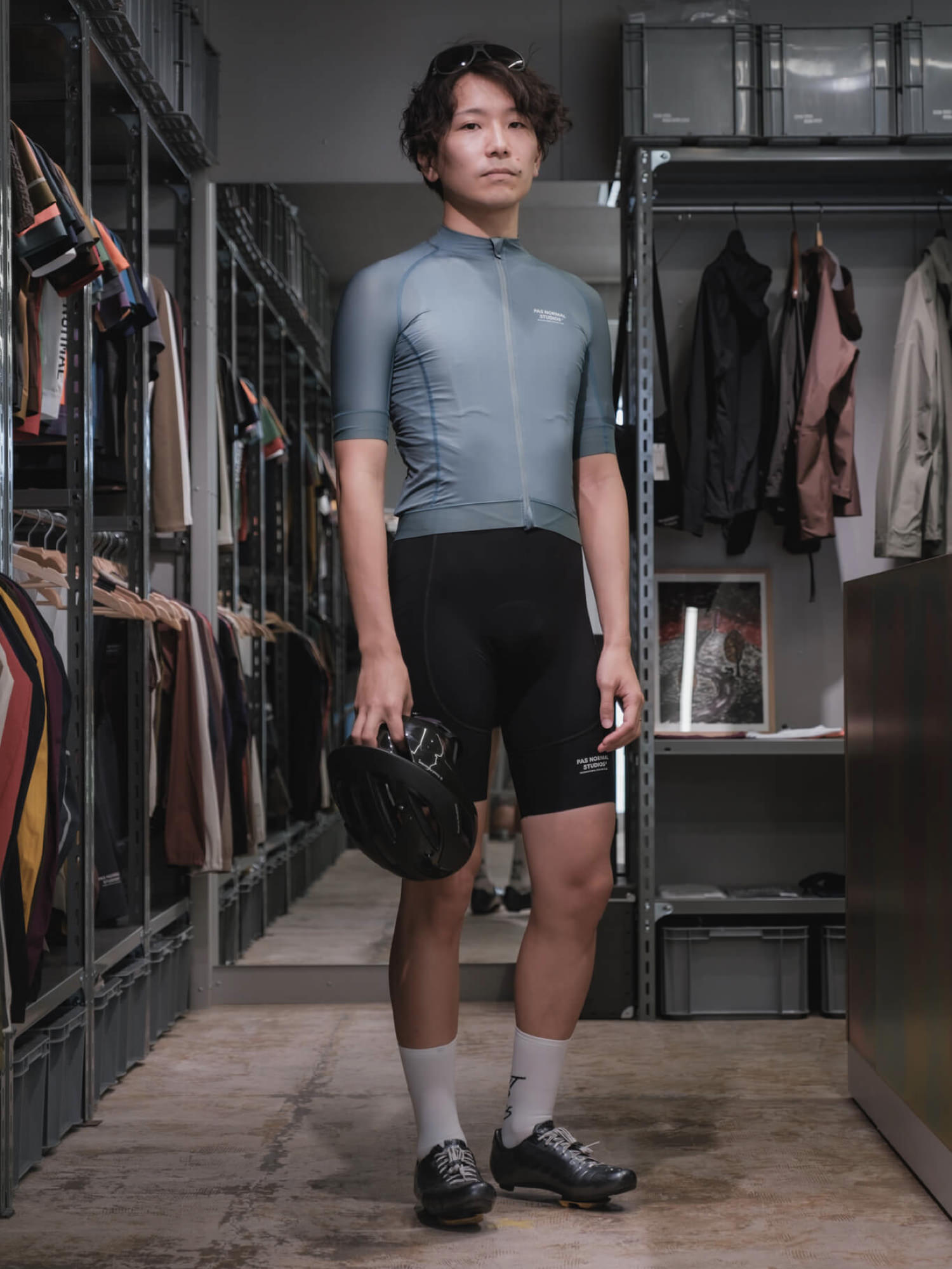
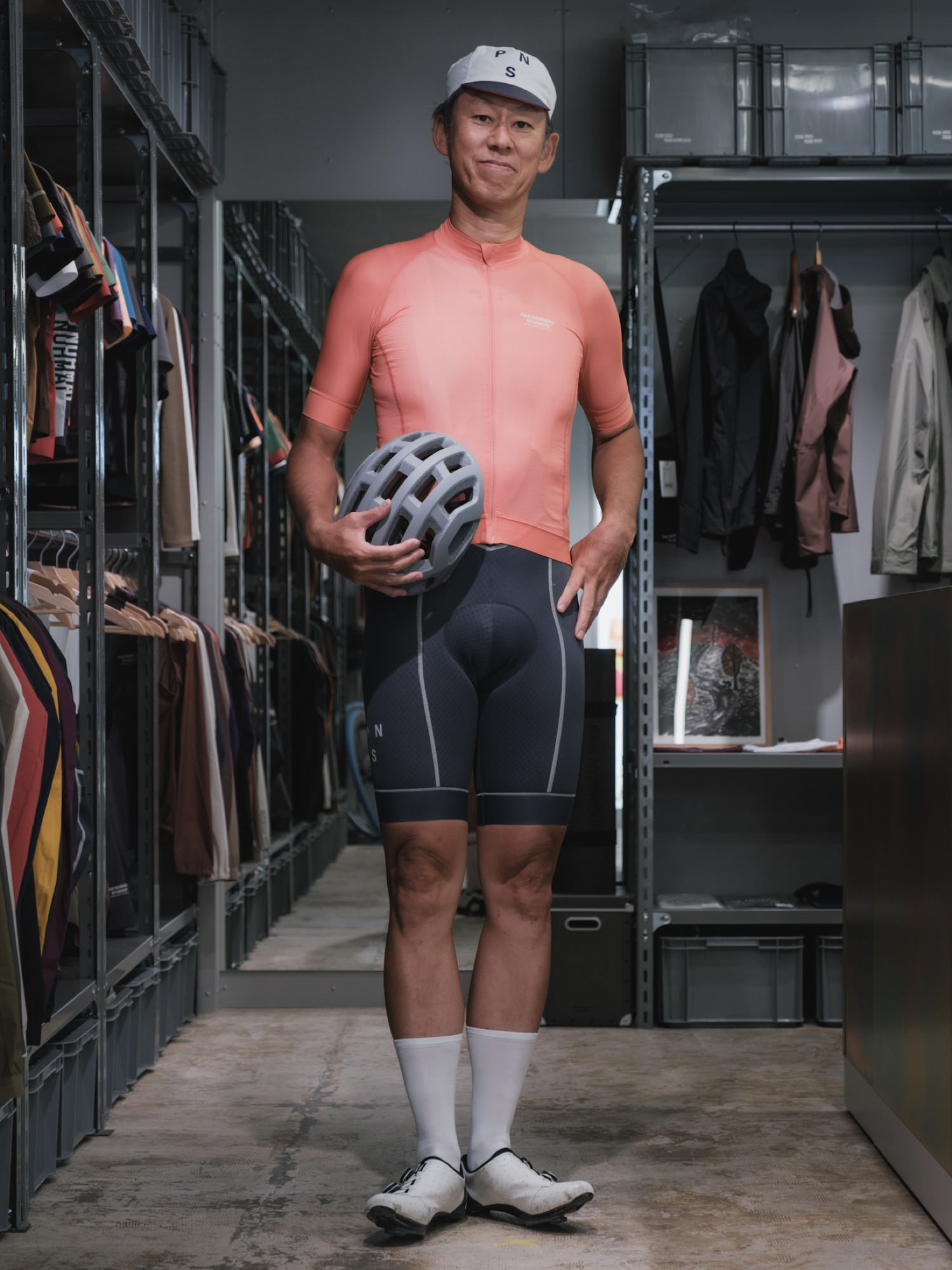
Tats: Personally I’d point to light grey. It works whether you bring a dark or a bright jersey to the pairing, so it’s honestly far more versatile than black bibs. You’ll reach for it constantly, which makes it excellent value too.
An easy-to-wear light grey. Pair it with black for a refined achromatic setup.
It harmonises even when you bring in brighter tones.
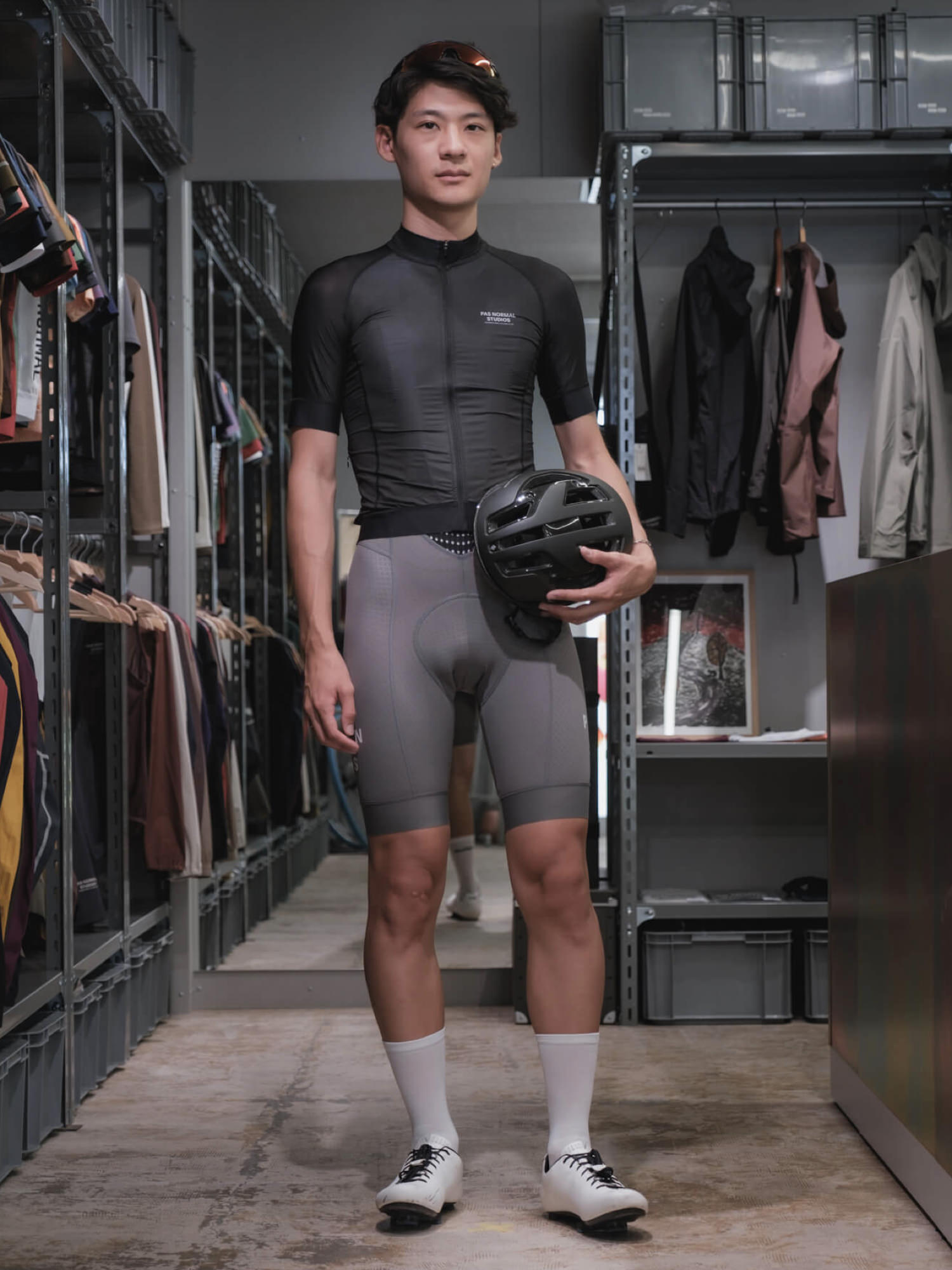
Yoshimoto: Makes sense. Jerseys give you more room to play with colour in terms of both lineup and price, so keeping the bottom achromatic is one solid approach. When achromatics like black and grey click together, it looks seriously sharp.
And conversely, if you go with a coloured bib, keeping the top achromatic means you can’t really go wrong.
Tats: Right. That said, coloured bibs are actually surprisingly easy to pair with just about anything. Once you discover the fun of coordinating tops and bottoms by colour, you fall deeper and deeper down the rabbit hole.
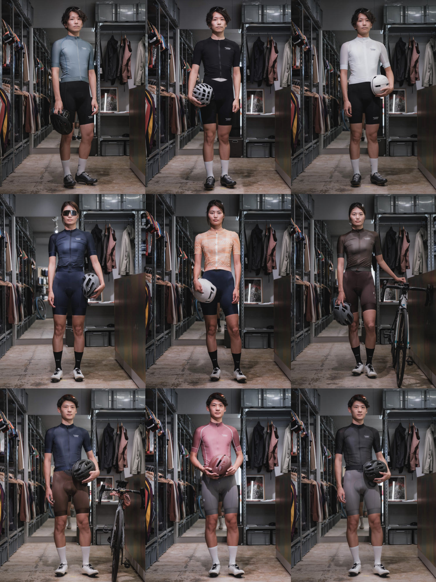
Coloured bib styling examples
Jersey / Mechanism Dusty Teal, Bib Shorts / Mechanism Pro Black
Jersey / Mechanism Dark Olive, Bib Shorts / Mechanism Dark Olive
Jersey / Mechanism Navy, Bib Shorts / Mechanism Bronze
Jersey / Mechanism Coral, Bib Shorts / Mechanism Dark Navy
2. Choosing the right size
Tats: Next, let’s talk about how to choose the right size.
Yoshimoto: Whether the size fits properly is arguably even more important than colour coordination.
Aside from certain lines built specifically for city riding, a jersey should sit snugly against the body. That’s the starting point for sizing.
Even with high-end brands like Rapha or PNS, you occasionally see people wearing them oversized, and it feels like such a waste. It doesn’t just spoil the look, it also robs the jersey of its performance.
Tats: If a shop that carries the brand you want is within reach, it’s worth going to try things on.
And even if not, if you don’t yet have a clear sense of what size actually works for your body, going to a shop that stocks cycling apparel and picking your first piece with their advice is a great way to start.
It all begins with learning the fit unique to cycling apparel.
Yoshimoto: Shops that still choose to stock apparel in this day and age tend to genuinely love it, so you’ll usually get proper advice when you visit.
I’m into PNS these days, but honestly, PNS’s fit was hard to accept at first. I remember thinking, “Am I really supposed to wear it this tight?!” But when you actually see it in photos, that’s the fit that looks right.
Tats: I totally get that initial hesitation. What makes sizing even trickier is that fit can differ between series within the same brand. PNS Essential vs Mechanism, or Rapha Core vs Pro Team, for example. For those, visiting a flagship store to get a feel for the sizing is the safest bet.
Yoshimoto: Every brand has its own intended way of being worn. Checking the brand’s site and Instagram to lock in the visual image first gives you a solid reference for how the fit should feel when you put it on yourself.
View this post on Instagram
Use the brand’s official styling as your baseline reference
Tats: When there’s no shop nearby, you end up relying on each brand’s size guide.
Yoshimoto: The tricky part is when your body sits right between two sizes on the chart.
Tats: Classic problem.
Yoshimoto: In that case, going one size down is usually the right call. Unless you really can’t stand a tight fit. Sizing up can leave excess fabric bunching when you drop into position. Today’s fabrics stretch really well, so even something slightly small will wear properly.
Tats: Our LOVE CYCLIST brand reviews always list the model’s build and the size worn, so readers can use that as a reference too.
Yoshimoto: One more thing I’ve been feeling lately: adjusting your sizing sense with age matters.
Tats: How so?
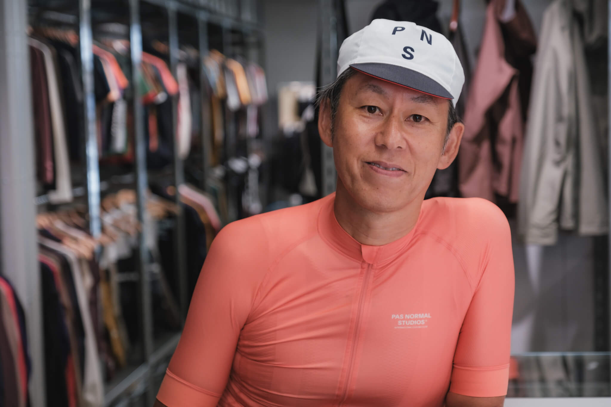
Yoshimoto: With PNS, I’ve started finding Mechanism’s racy fit a bit too tight, and I’ve been gravitating toward Essential recently. My body doesn’t carry fat the way it did in my younger days (laughs), and Essential’s silhouette fits me just right.
The fabric has a matte quality too, giving it a slightly more refined feel than Mechanism. I’d recommend it to middle-aged riders, or anyone wanting to soften that racy look a bit.
Tats: Middle age paired with Essential — that’s a good combination.
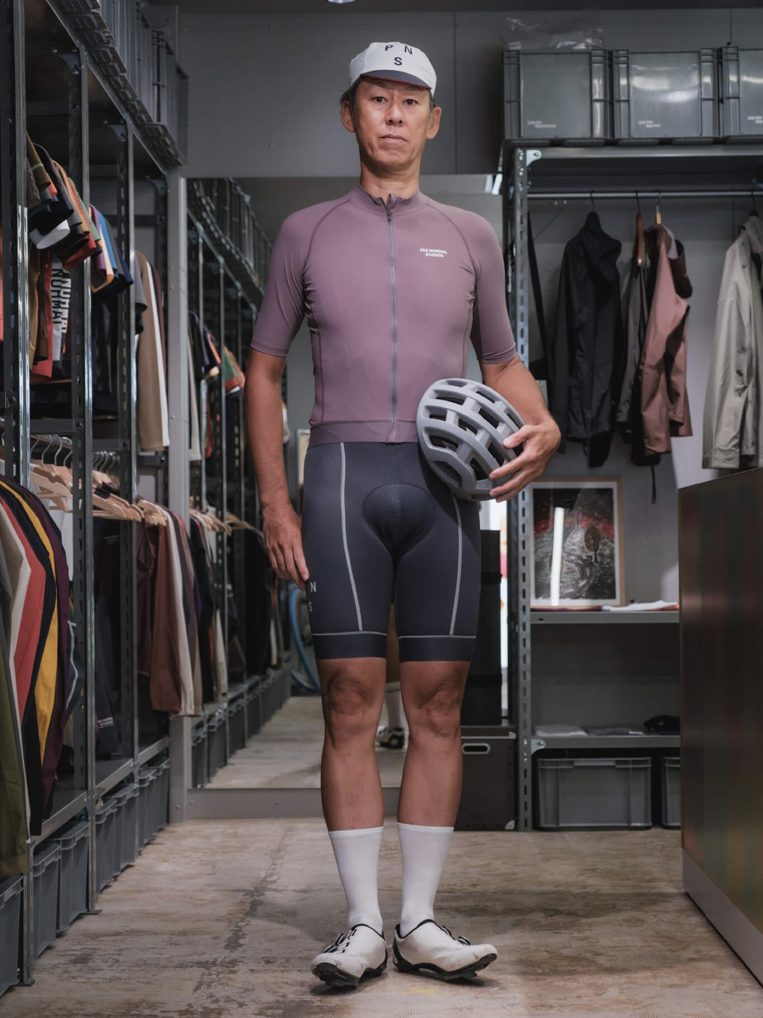
Yoshimoto prefers Essential jerseys, which don’t compress too tightly
3. Choosing your accessories
Tats: Once the jersey and bibs are dialed in, next comes the accessories — helmet, eyewear, socks, shoes.
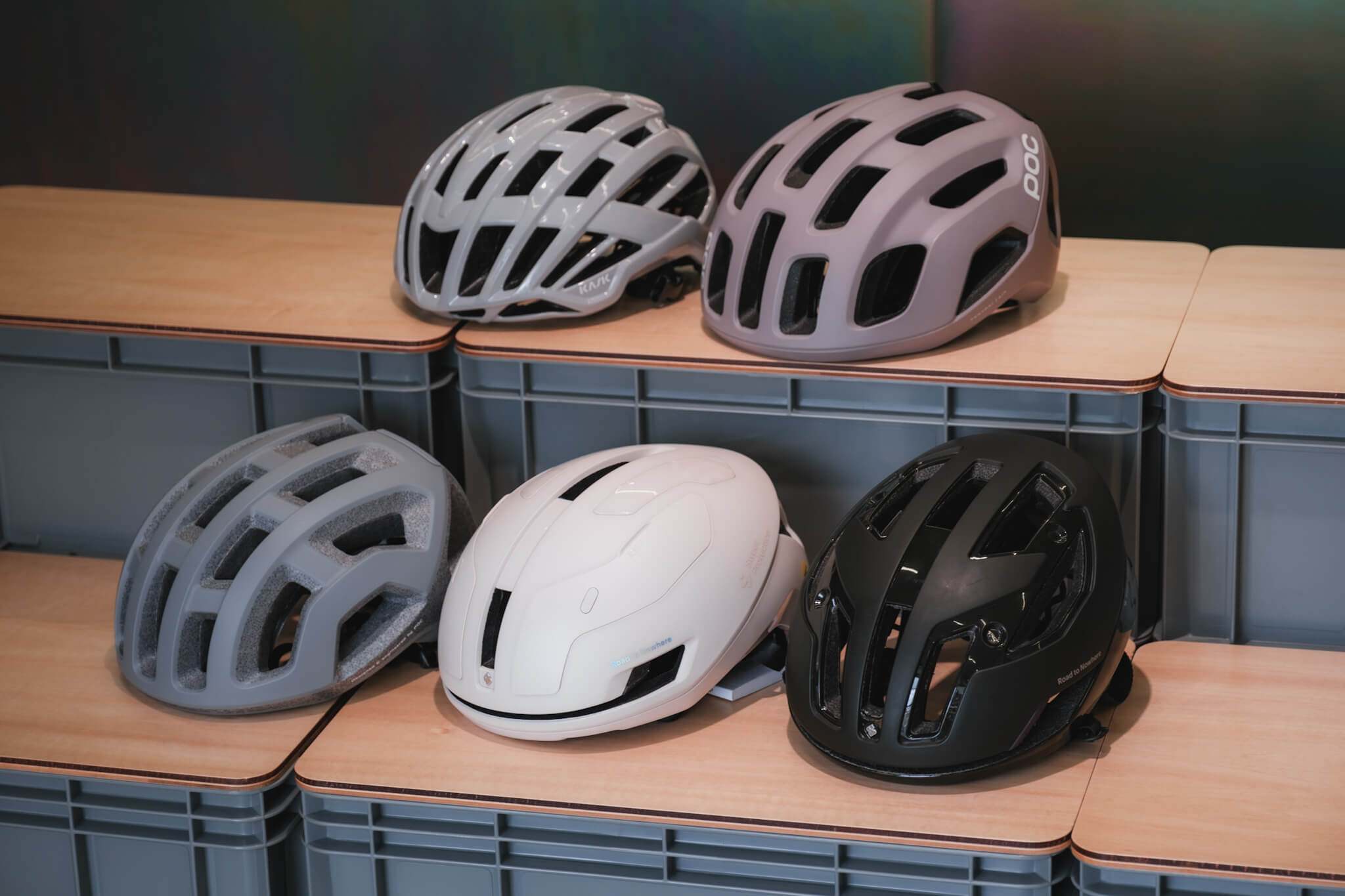
Yoshimoto: The rule with accessories is simple: pick white or black. If they clash, choosing colors for your kit becomes really difficult.
Lately grey has emerged as an option for helmets and shoes too. Keeping accessories in achromatic tones makes the color play we talked about in chapter one much easier to pull off.
Helmet
Tats: How many helmet colors do you own, Yoshimoto?
Yoshimoto: Grey, white, and navy. I don’t own a black one, so I’ve been wanting to add one. (Spotting the new KASK Elemento in black on display at the shop) This one is seriously good (laughs).
Tats: It looks great on you (laughs). Achromatic wins again. My lineup is pretty similar.
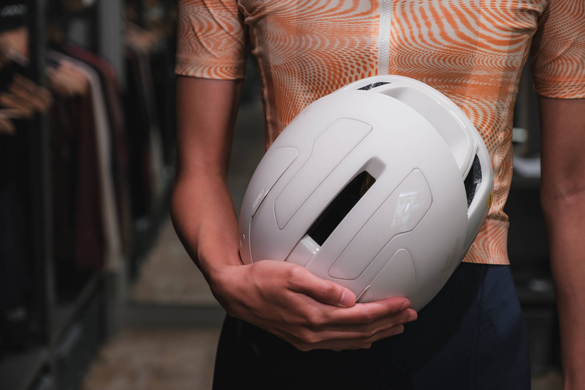
But something I’ve been thinking about lately: as jersey and bib color palettes shift from primary colors toward nuanced, muted tones, a white helmet has become harder to pair. It can end up looking like your head is floating.
Yoshimoto: True. Gloss finishes especially stand out in a bad way. So if you’re going white, matte white is the safer pick. And the lineup for it has grown recently.
Beyond that, the slightly dusty ivory tones from POC and Sweet Protection work well, and grey is a genuinely versatile color too.
A helmet in a subdued tone brings the whole look together
Tats: Helmet shape matters too.
In our community, KASK, POC, and Sweet Protection dominate. What sets these brands apart from the others?
Yoshimoto: Well… I think the dividing line is whether it looks like “sentai gear” or not. The sentai-style shapes give off that hardcore racer vibe, and they’re pretty hard to pair with recent apparel.
Tats: That expression (laughs). In that case, sticking to the brands mentioned above is a safe bet.
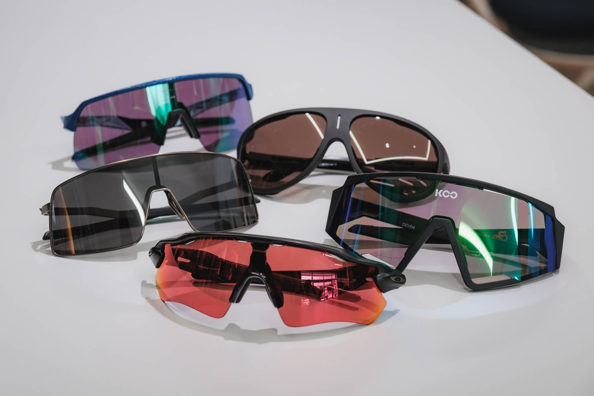
Eyewear depends on facial features, so you need to try several pairs to narrow down what suits you
Footwear
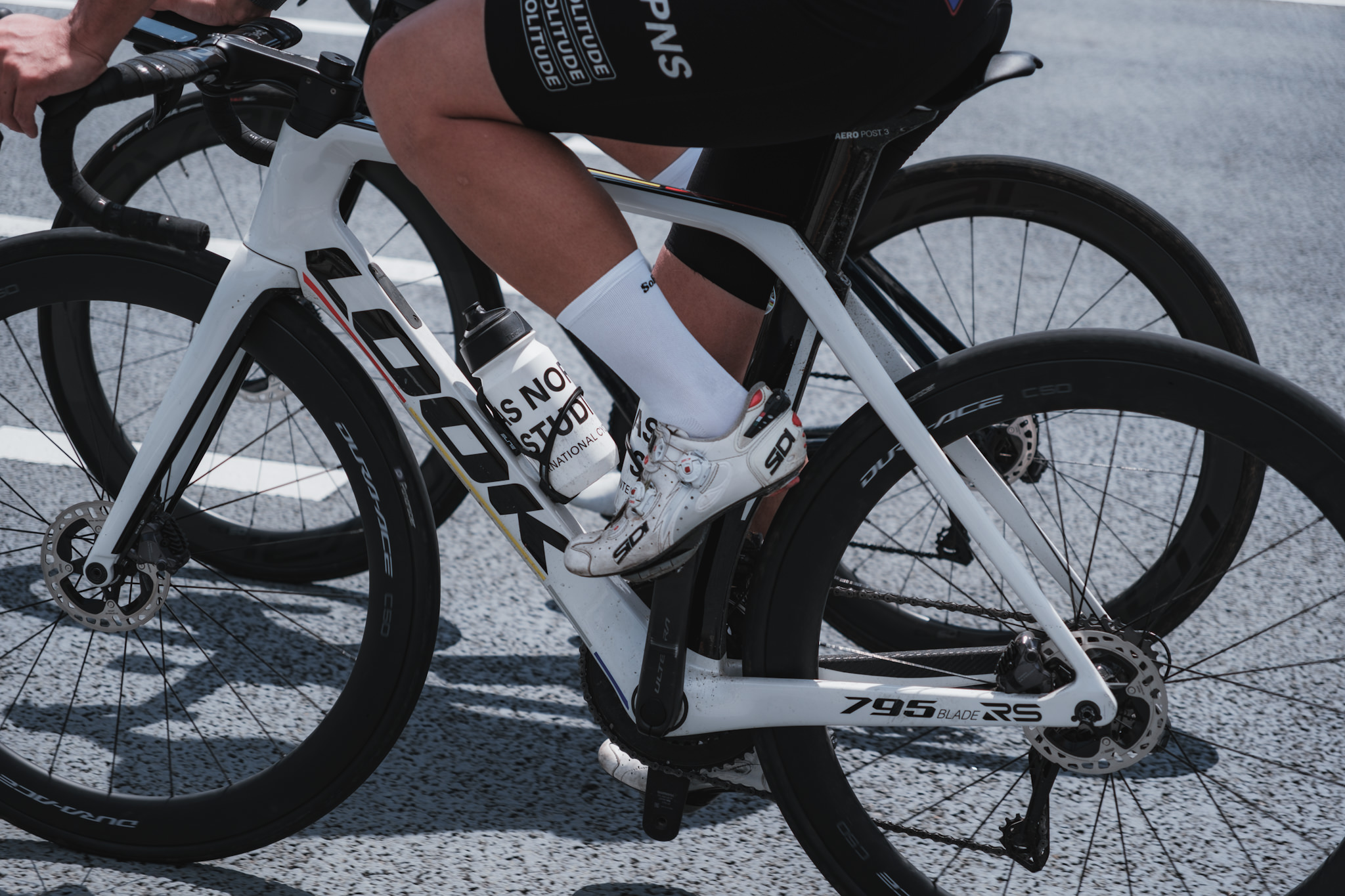
Tats: Road shoes are basically white. White shoes really go with anything.
Gravel opens up different options, but for the tight, clean jersey-and-bib combination, white feels like the standard.
Beyond that, it comes down to whether they fit your foot.
Yoshimoto: Mid-grade and lower-grade shoes have improved a lot in performance recently, so unless racing is your main goal, you can pick any grade as long as the design and fit work for you.
Tats: True. In the past, non-high-end shoes had a certain clunkiness to them, but brands like Fizik and Specialized have raised the bar across the board. And with emerging brands like Udog offering more accessible pricing, we’re in a great era with more choices than ever.
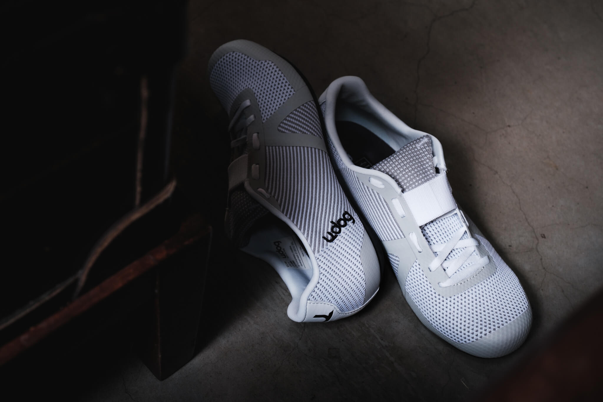
Shoe design has been elevated across the board
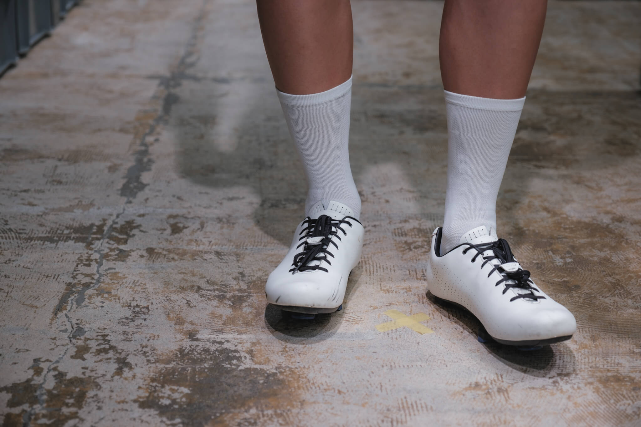
Yoshimoto: Socks are white too, right?
Tats: Yeah. White, black, and navy are the basics. A few years back, flashy sock designs were a popular way to add an accent to your outfit, but lately the trend is to keep things simple and make everything harmonize head-to-toe.
Yoshimoto: Let’s talk about sock length too.
Tats: I can only speak to the last decade or so, but they’ve been getting gradually longer, haven’t they?
Yoshimoto: Exactly. In the 2000s, about 3cm above the ankle was standard, but ever since Lance Armstrong started wearing long socks, they kept getting longer. At the time Lance’s length was generally considered uncool, but now covering the lower part of the calf has become the standard.
Tats: That length is the trend, but for shorter riders it has the downside of making the legs look shorter. So some people deliberately choose shorter socks as a styling choice.
Sock length affects the visual length of your legs
Yoshimoto: Height is a tricky issue. The standard silhouette of today’s apparel originates in Europe, so it’s designed for taller builds. It’s a tough world for Asian body types to begin with.
Tats: Painful. You just have to work with your individual body type.
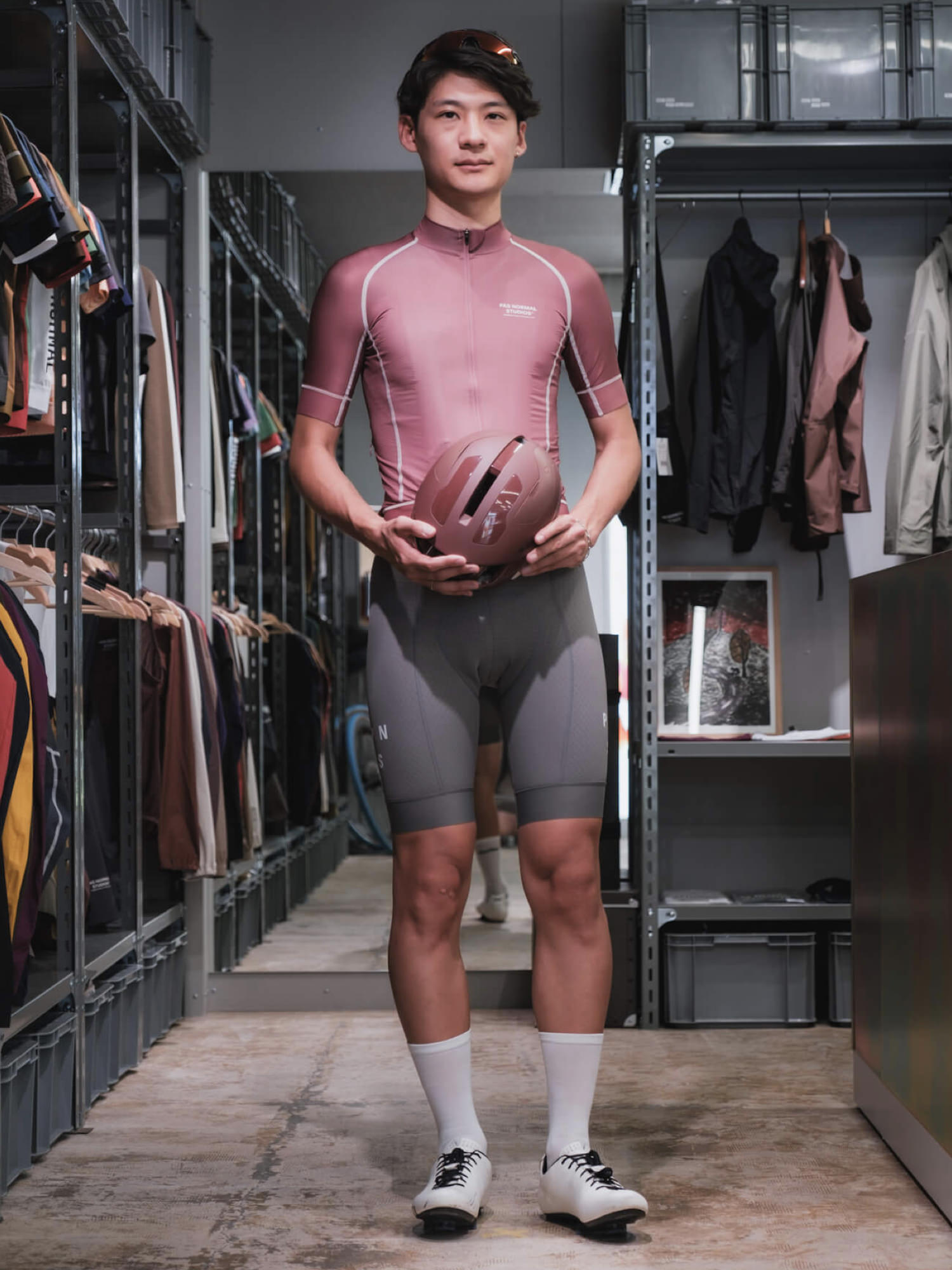
Yoshimoto: That said, Pas Normal Studios jerseys run on the shorter side, so they don’t look stretched out even on shorter riders. If you can’t find a jersey that suits you, PNS might be worth trying on.
Tats: Ah, that makes sense. Choosing based on the relationship between a brand’s cut length and your height could be one solution.
PNS jerseys have a shorter cut
4. Understanding Style and Function
Tats: Honestly, most of what we know about apparel came at the cost of a lot of money (laughs).
Yoshimoto: True. Both of us have been through plenty of trial and error, investing heavily in ourselves along the way. But looking back, none of that spending was really wasted.
Everyone tries to gather information and find the answer via the shortest route possible, but the shortest route actually gives you the least insight. Chasing efficiency in a hobby is counterproductive. Enjoying the detours is what a hobby is really about.
Apparel is the same as choosing equipment. The real pleasure is trying things out and making that knowledge part of yourself.
Tats: Exactly. What we’ve talked about today is just the fundamentals, and the most enjoyable part of the process is thinking about how you’d style things based on that foundation.
There’s still a widespread notion that “wearing Rapha or PNS is fashionable,” but if you’re going to choose these brands, I’d rather people focus on the joy of optimising for themselves, not simply “looking stylish.”
As Yoshimoto-san says, apparel is part of your equipment. In terms of optimising for yourself, choosing apparel is the same as choosing tyres or a saddle. And ultimately, that translates into the pleasure of the ride itself.
Apparel is a critical factor that shapes the ride
Yoshimoto: Apparel has two sides: “style” and “function.” Rapha and PNS tend to be discussed only in terms of style, but in reality the whole category has been elevated, function included.
Looking at the past decade or so, ASSOS and Castelli cultivated the functional side first, then Rapha and PNS took the lead on style. Within that flow, the brands started influencing each other in a healthy way. ASSOS’s design has become far more compelling, while the so-called style brands have been pushing hard on function.
Tats: I’d love for readers to adopt this kind of perspective and discover the fun of styling for themselves.
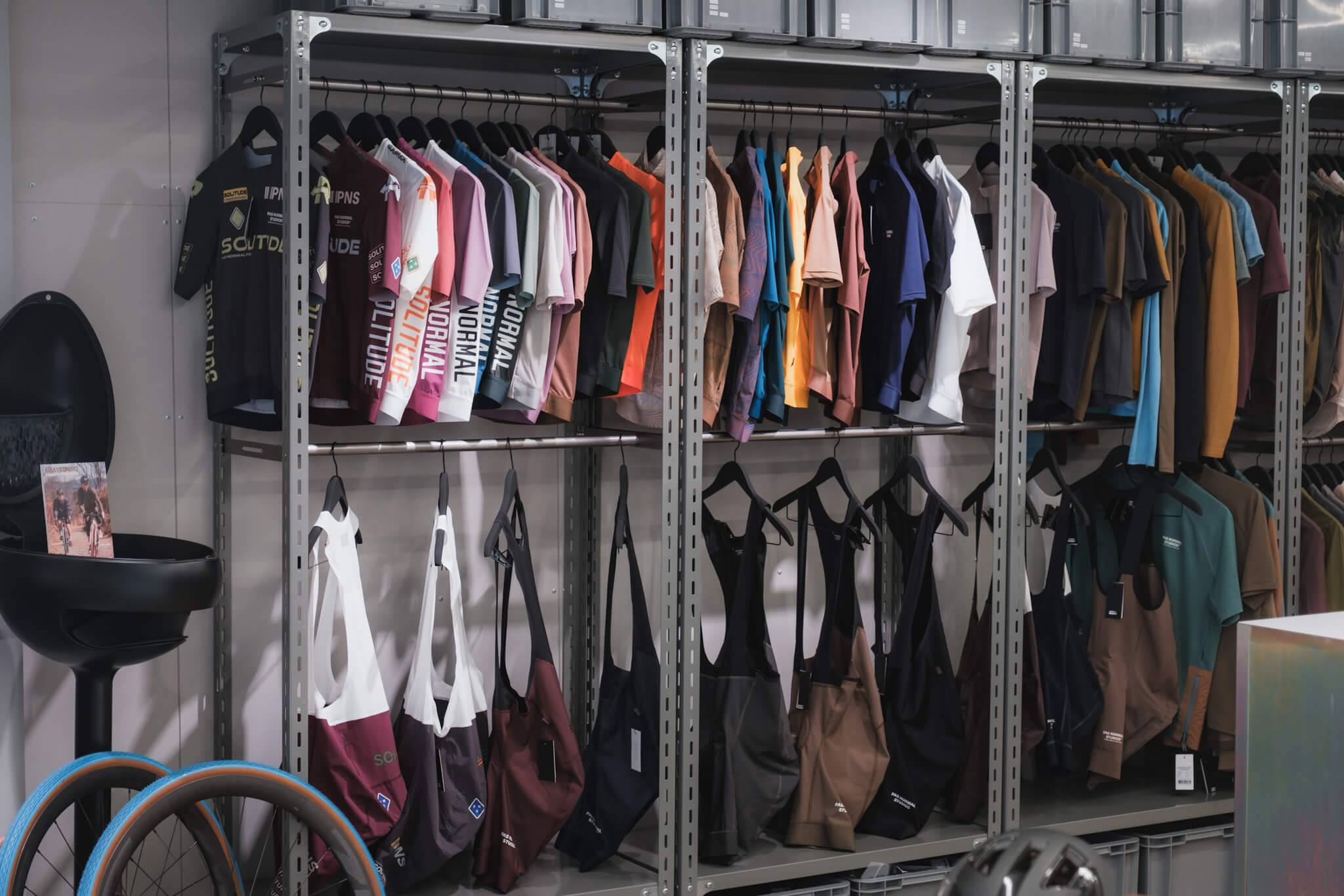
Browse the Pas Normal Studios lineup (MAGNET)
Styling in cooperation with: MAGNET
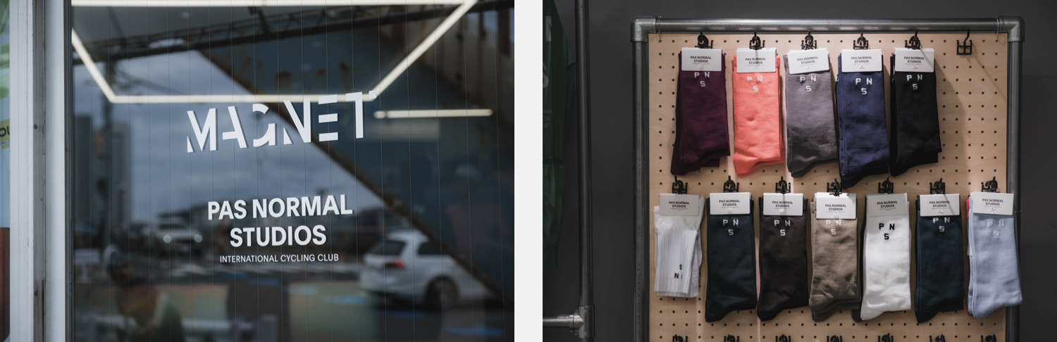
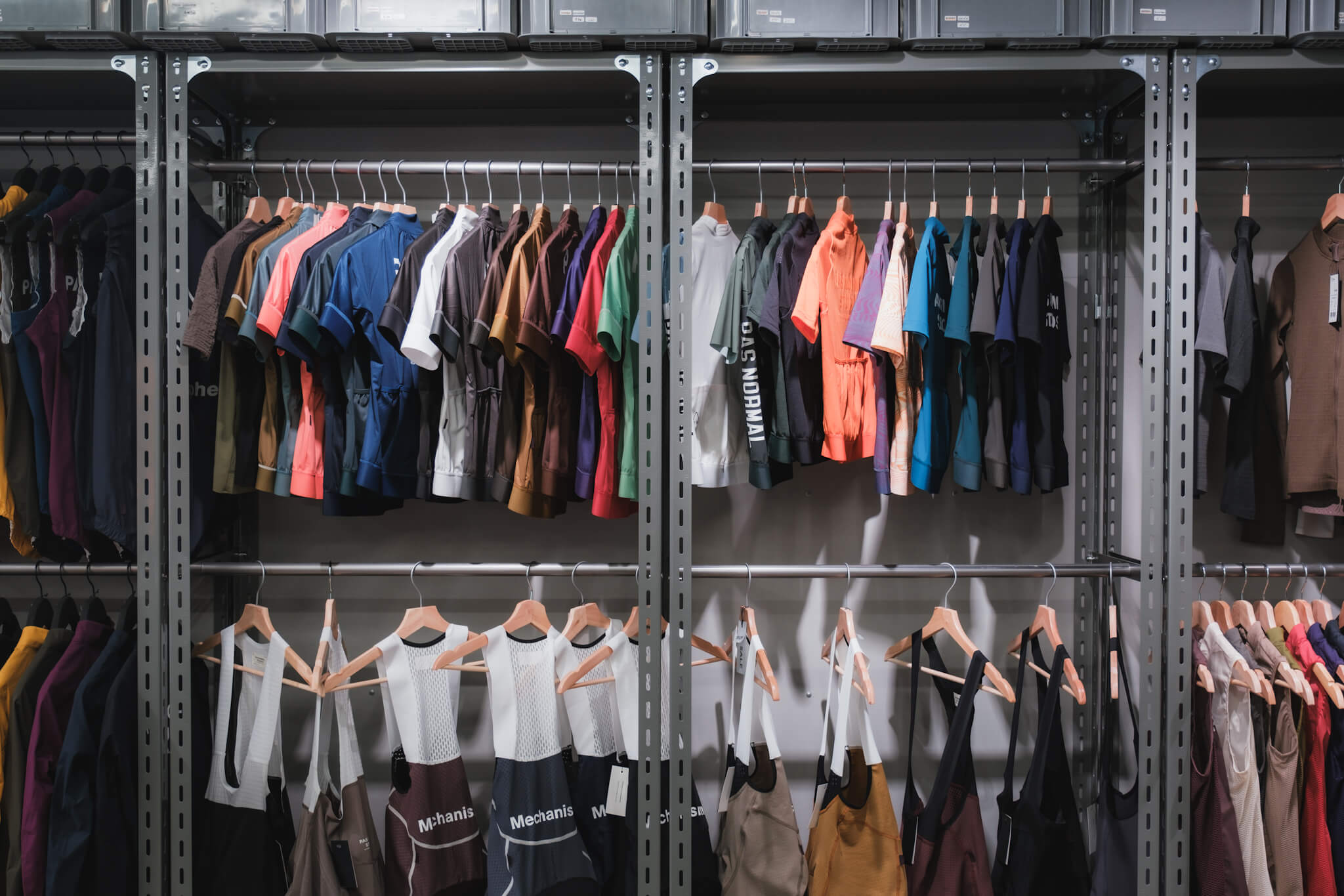
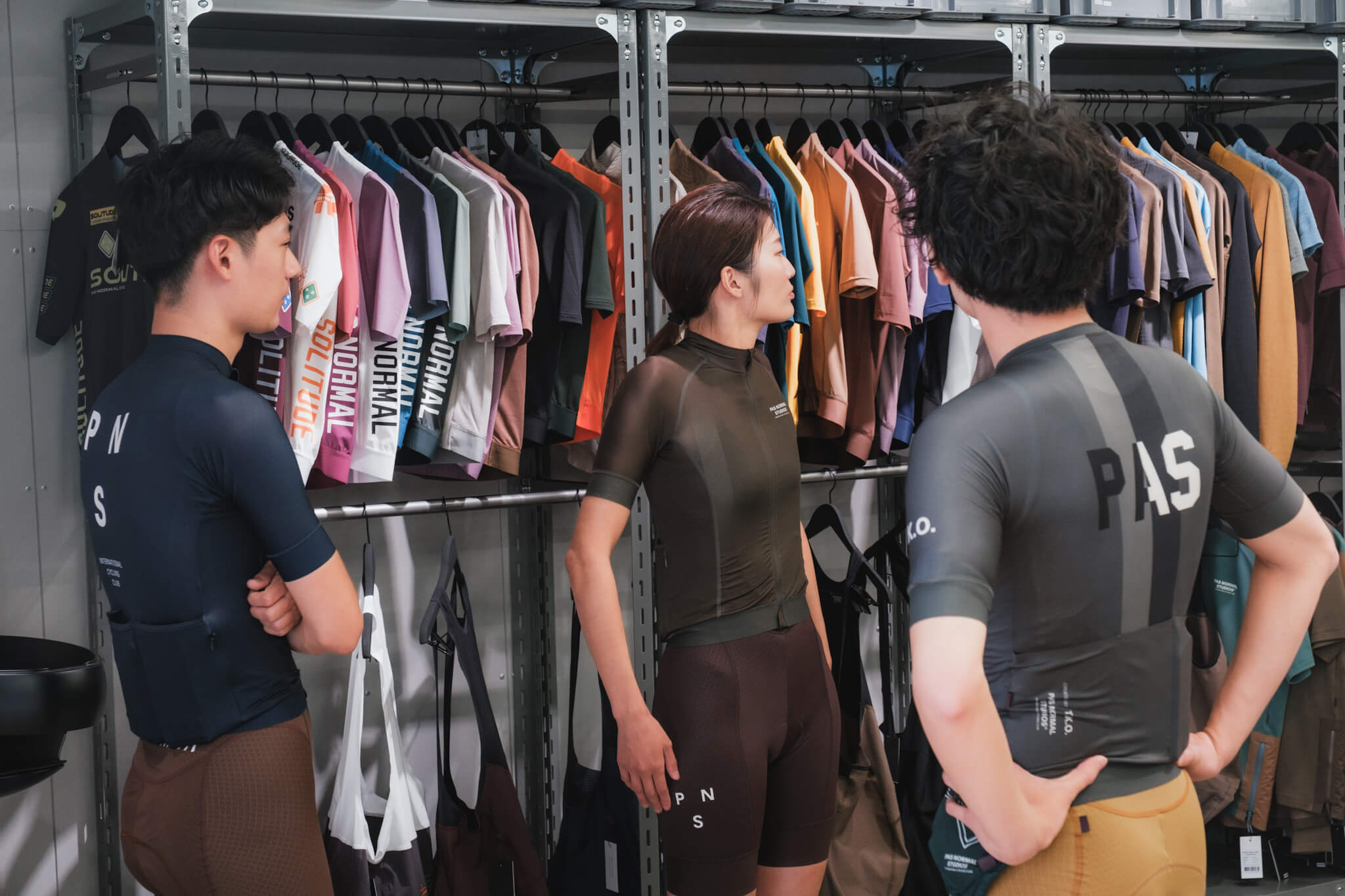
MAGNET, located near Gasbashi bridge on the Tamagawa, carries an extensive lineup of Pas Normal Studios.
The refined, apparel-shop-like interior and displays have earned a reputation for being welcoming to female riders too. You can pick up and try on garments in person, and the staff will suggest coordinations from a huge range of colours and collections, so you can ask a knowledgeable third party what suits you in a friendly, relaxed setting.
If you want to experience the world of PNS, this is a shop worth visiting.
Model / Hiroko, Miki, & Masanaga
Photo / Tats & Tong Liu
Edit / Tats
[PR] In partnership with: Magnet LLC
Related Articles