Since the early 2010s, many brands of cycling apparel have emerged; as of 2023, the concept and design of each brand is consolidating in the same direction, and cycling clothing has now entered a period of complete maturity.
This is undoubtedly the reason why several brands have been renewing their logos and undergoing significant rebranding for the past two to three years. We will look at how they are rebranding.
text / Tats (@tats_lovecyclist)
Contents
Background of Logo Renewal
Brands renew their logos for a variety of reasons.
- – To respond to changing times and trends
– To change the brand identity
– To increase visibility (print and digital device support)
– To change marketing strategy (change in target audience, change in key products)
This is just one example, but in most cases it is a combination of several reasons.
A logo change involves a significant cost to renew products and advertisements, but it is unclear whether the new value will be well received by users.
If it works now, the new brand value will spread, and if it fails to meet expectations, there is a risk that the brand value will decline.
How do you feel about the following brand new logos?
1. Isadore

Isadore was founded by the Velits brothers, former professional Grand Tour racers.
The company is revamping its logo and lineup in 2023, making it the most drastic rebranding of the brands in this article.
We believe there were two problems with the old logo in calligraphy.
One is that the thickness of the lines is not consistent, so the logo is noticeably distorted when printed on clothing.
The second is that the design of the logo is so strong that it cannot be printed in large sizes on clothing and is difficult to combine with other fonts and design elements in a creative way.
The new logo design solves all of these problems. The spaced letters are “inspired by cyclists riding at equal intervals in a proton,” according to Velits, and the forward-looking, dynamic font evokes a bright, positive future.
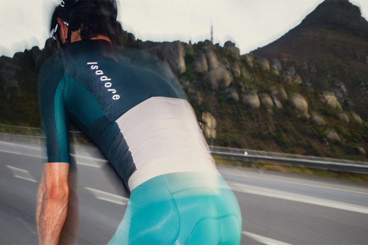
The new logo can be placed larger than the old logo and will contribute to brand recognition
2. Attaquer
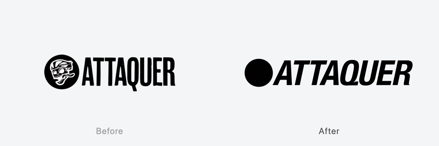
Founded in Sydney in 2012, Attaquer is based on the concept of “be your alter ego” by wearing it.
The old logo’s skull and crossbones symbol, which represented “your alter ego,” is now blacked out in the new logo, leaving it up to the user to decide what kind of person he or she wants to become. The letters of Attaquer are in flowing italics and clearly weighted to increase visibility and give a stylish impression.
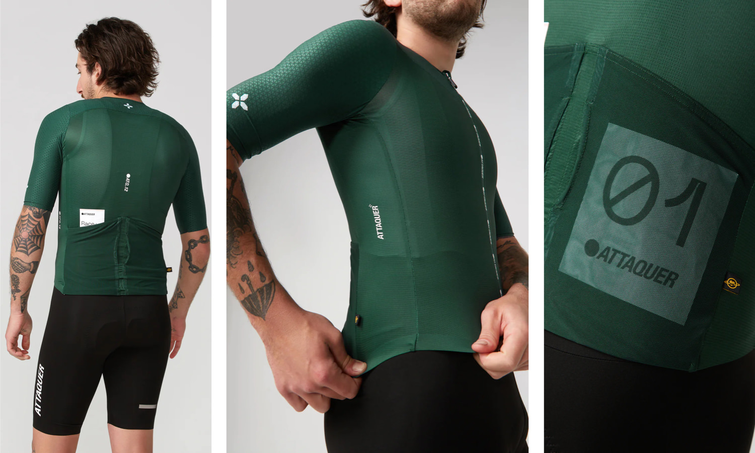
The main “Race” lineup is simple, with minimal logos.
3. Café du Cycliste
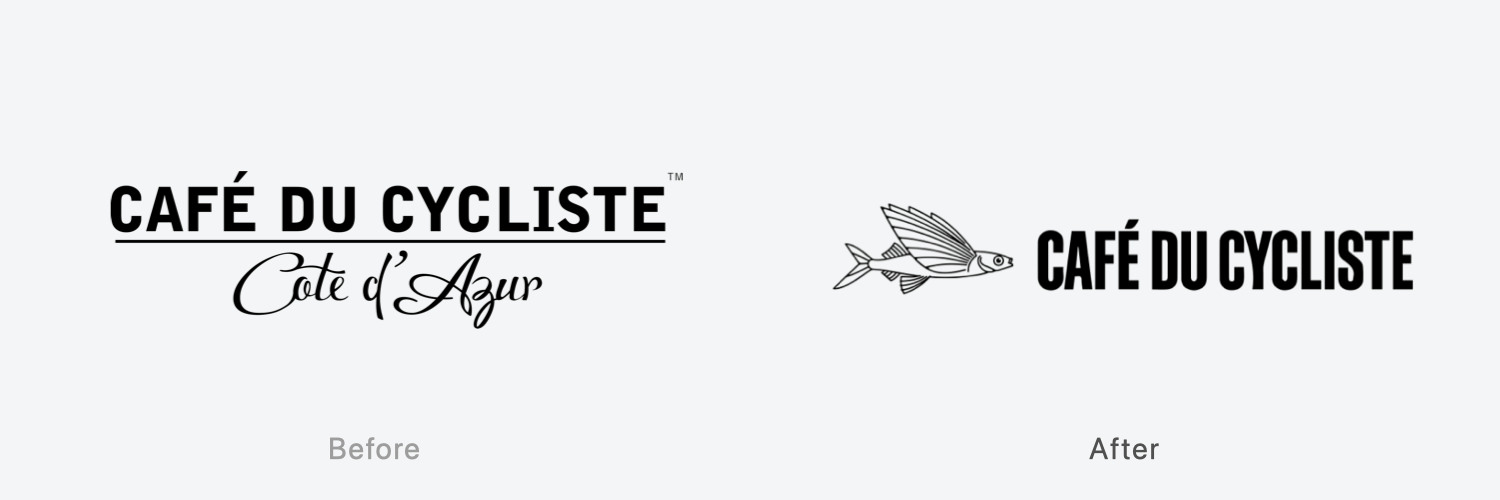
Café du Cycliste‘s clothing seems to capture the open seaside atmosphere of the French resort town of Nice.
The old logo was designed to look like the name of a resort hotel with the calligraphy “Côte d’Azur,” but as the brand has grown, the place name was removed from the new logo. The font is higher in weight and the spacing between the letters is narrower to create vertical and horizontal cohesion.
The logo also features CDC’s signature flying fish, which we feel successfully expresses the atmosphere that the brand has traditionally had.
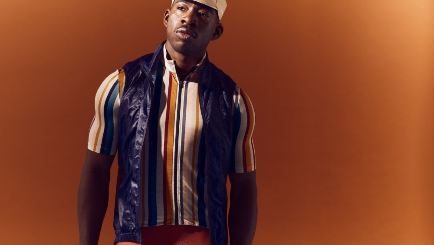
Logos are often not printed on products, but they are still the only design feature that is instantly recognizable as CDC’s.
4. Pedla
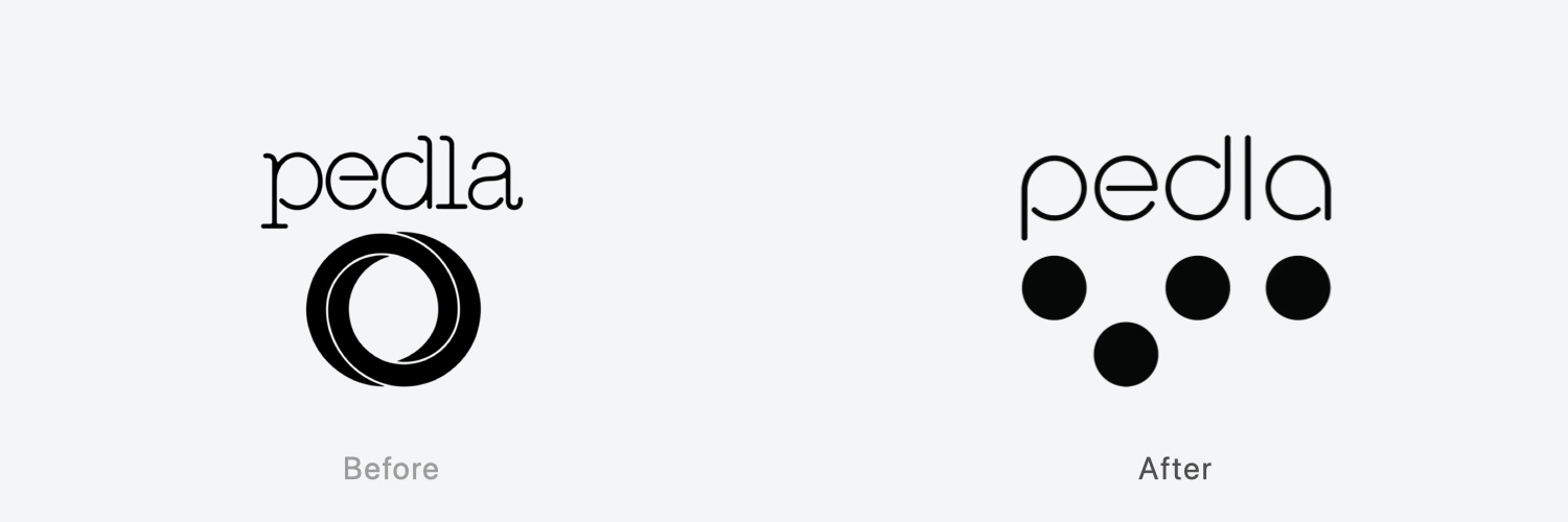
Born in Melbourne, Australia, Pedla is a brand that combines performance and design excellence, especially around the sleeves and hems.
The old logo was an impressive intertwining of two circles, but the new logo is a major overhaul of the entire logo.
The design of four dots in a row seems to imitate the movement of a peloton taking a lead change. The rounded Pedla font not only gives a sense of familiarity, but also forms a rhythmic and joyful image, like a musical note, when aligned with the Pedla dots below.
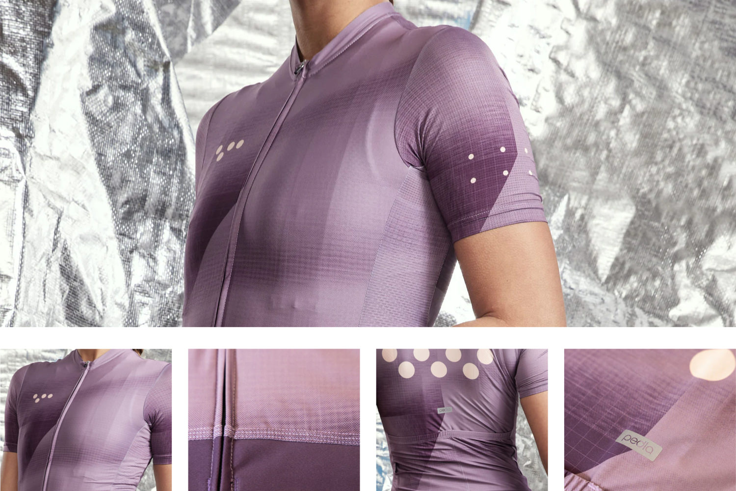
The brand name is small and the dots are boldly placed in various places.
5. Velobici
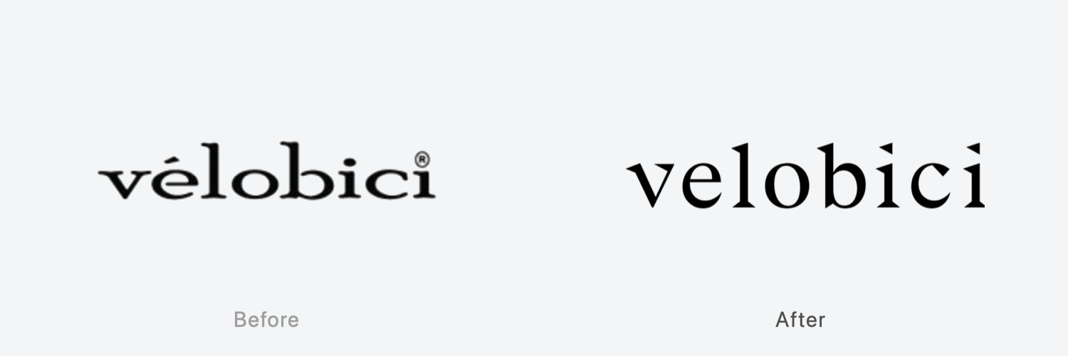
Founded in 2010, Velobici is a luxury brand using the finest merino wool, and is committed to Made in the UK to revive the local knitting industry.
The new logo is classic and sophisticated, replacing the old country-style logo that retains a crafted feel.
The wide spacing between the letters, which gives the logo a luxurious feel, and the elimination of the “e” accent, in favor of a left-facing triangle as the common element of each letter, keep the overall harmony and the intent to move in a certain direction.

The product manufacturing has not changed significantly since the company’s founding, but it can be said that it has been perfected as a luxury line of clothing.
6. LA PASSIONE
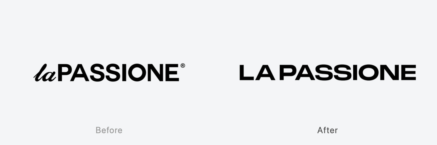
Italian brand LA PASSIONE has its roots in Italian culture, where tradition and innovation are fused together in art, architecture, and music, and it incorporates its unique aesthetic sense into its products with design at the core of its products.
The reason for removing the “la” in the calligraphy appears to be the same as for Isadore, but the new logo has a more profound sense of Italian tradition.
Incidentally, such simplification may seem easy, but it is more difficult to balance than a complex design, which makes it more sophisticated.
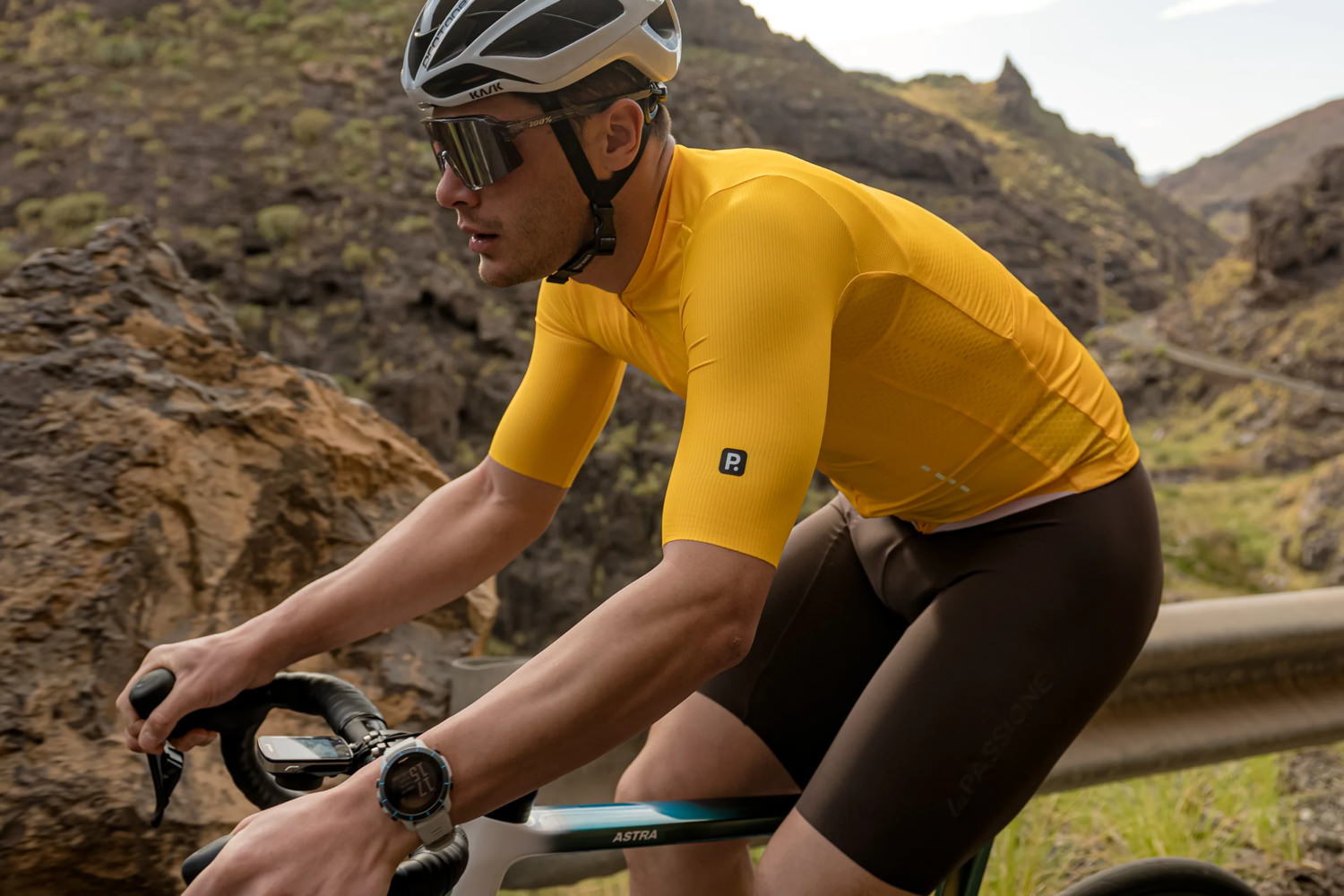
There is also a newly developed logo on the sleeve. The white dashed line on the abdomen continues from the old logo (this represents four cyclists riding in a parade).
7. Push Hard
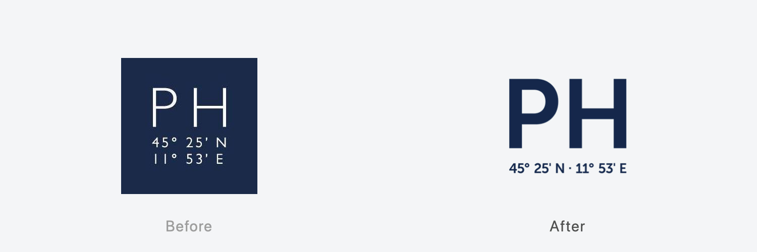
Push Hard of Italy was born in Padua, Veneto, and produces elegant products based on the charm of the hilly region. The coordinates at the bottom of the logo (45°25′ N, 11°54′ E) indicate the location of Padua. The brand color is blue, giving the products a clean overall impression.
The square shape of the old logo creates restrictions in design, so the new logo removes the frame, and as the name “Push Hard” suggests, the logo has both balance and identity by placing the coordinates of Padua in a well-balanced manner, while expressing the full force of the logo.

The technique of boldly printing PH is based on the design of the new logo. It is a significant change from the previous image.
8. Morvélo
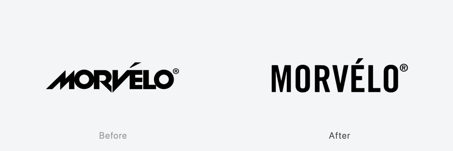
The British brand Morvélo is known for its vibrant products that fuse bicycle culture with pop culture.
The old logo, which consisted of a sharp-edged font to reflect the brand’s sharp sensibility, needed to be updated, perhaps because of its limited target users.
In order to make it more universal and acceptable to a wider range of users, the logo was transformed into a universal logo by widening the letter spacing to increase visibility and adopting a vertical font.

Although the logo design has calmed down, it has not lost the funky worldview that is typical of Morvelo.
Extra: MAAP continues to change its logo for products
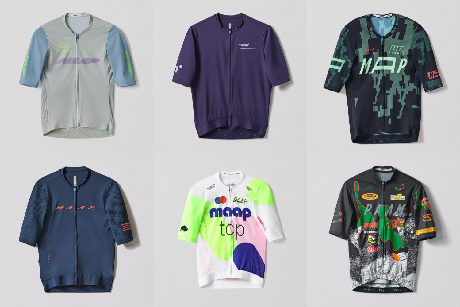
MAAP began changing the logo design it places on its products two years ago on a seasonal basis.
MAAP’s designers do not discuss the design intent behind their collections. From the very beginning, MAAP has emphasized that it is only a technical apparel company.
Despite this, in the last two years MAAP’s apparel has become more focused on design as a means of communication. It is a method of continually renewing the brand image by releasing new designs in small lots, one after another. This is a move that requires a lot of capital from the creators, but it is also a sign that the brand is trying to move to a new stage as a cycling apparel brand by fusing technical and fashion aspects.
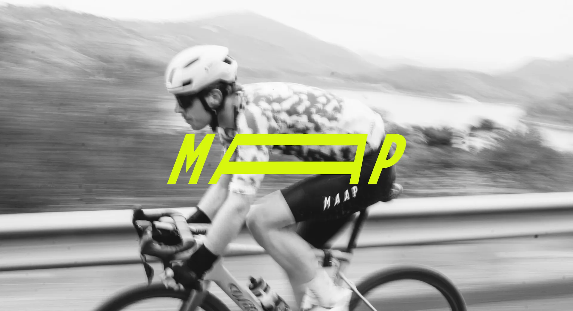
New image of SS23 ©MAAP
Author
 |
Tats Shimizu(@tats_lovecyclist) Editor in Chief. Having been riding sports bikes for 10 years. He likes to unravel the trends in the sport bike industry, especially road bikes, from a marketing perspective. At the same time, he has extensive friendships with cycling apparel brands from around the world and proposes various styles through the media. His main bikes are Factor O2 (road) and LS (gravel). |
Related Posts


